Today, I’m thrilled to have Nicole Y. Adams with me for a new What’s in a Brand? interview. Nicole Y. Adams is a German-English translator based in Brisbane, Australia, and is the founder of NYA Communications. She specialises in marketing, corporate communication and PR and offers her wide range of services to small businesses. Nicole is also a prolific author as she has penned “The Little Book of…”, a series of books on time management, networking, marketing, and other important topics for freelancers. More recently, Nicole has published a book on diversification in the language industry and “The Bright Side”, an ebook that aimed to highlight the positive aspects of our industry.
Hello Nicole. It’s such a pleasure to have you here as I’ve admired your brand for quite some time now. First of all, let’s go back to the start: do you remember where you first learned about branding? If so, did it take you long to realize that you just had to create a brand for your business?
First of all, thanks for inviting me to take part in your very interesting series, Emeline. It’s a pleasure to be part of it! I was first faced with branding when I started out back in 2003. I was thinking about setting up my first website and wanted to build it myself. I asked a friend who was a designer to create a logo for me, but it was very basic by today’s standards. It was a simple combination of a Union Jack and a German flag; nothing outstanding and certainly nothing I’d use today! Looking back now, my first website was pretty terrible. I had no coherent branding, no professional design, and only a semi-professional logo. Over the years, I ‘rebranded’ my website a couple of times, but I always did it myself and never had a professional logo designed. After a while, I thankfully realised that I had to invest in branding to achieve a more coherent and professional look.
You distinguish yourself from other translators and translation businesses by including “Communications” in your business name instead of “Translations”. Was that intentional on your part? Is it related to the fields you work in, i.e. PR and marketing?
Yes, using ‘communications’ in my business name was deliberate. For almost a decade, my business name was ‘NYA Translation Services’. When I finally decided to rebrand, or rather to adapt my brand to my evolving business and specialisations, I definitely did not want to call it ‘Translation Services’ or ‘Translations’, simply because I offer additional services that I felt needed to be reflected in my business name. ‘Translations’ or ‘Translation Services’ was too restrictive for my purposes. As you say, I work in the fields of PR and marketing, and I felt that a name that includes ‘communications’ would be more attractive to clients as it refers to the whole picture, i.e. the entire process of communication, rather than just one aspect of it (translation).
Can you tell us a little bit about your logo? How long did it take you to come up with it?
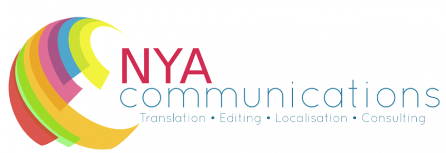
My logo was designed by the team at Websites for Translators. I had a rough idea of what I wanted, but I must admit that the result was completely different from what I had imagined. I browsed the Internet for logos I found appealing and sent the designers a list with my comments about what I liked or disliked about each one. I knew I wanted a contemporary shape reminiscent of a globe, and I had decided on the colours of the lettering before the logo was designed (‘NYA’ in scarlet/dark pink and ‘communications’ in a shade of bluish-teal). I felt these colours best represented my personality and created a nice contrast that is perhaps also indicative of my different lines of business.
When the designers returned the proposed logo, it was a lot brighter than I had expected, but I immediately recognised its potential and how it could become a perfect match for my brand. Admittedly, the bright colours are not what I would have chosen if I had designed my own logo from scratch at the time, but I’m glad the designers came up with them, as I feel the they helped my business grow into its brand, so to speak. The logo was a very significant factor in how my business evolved after rebranding; it kind of led the way!
I particularly like the fact that you’ve assigned a specific color to each service you’re offering. That’s a great marketing technique that is used by manufacturers on their packaging. How did you come up with that idea? Do you think it adds something to your business?
When I chose my website template, I really liked the idea of having a slider on the home page. I had initially planned to use different images on each of the ‘slides’, but with the designers’ input I opted for assigning a different colour to each ‘slide’ that would also match the different colours in my logo. I think the slider is a fun element that distinguishes mine from most other translator websites. Having a different colour assigned to each service makes them more memorable and makes it easier to find the different services on offer, whilst still maintaining a coherent overall look.
We all know that branding is more than a name and a logo. If you had to choose three words to represent your brand, which ones would they be?
Contemporary, professional, distinctive.
Finally, how do you manage to convey these aspects to your customers?
I think my website indicates to clients the kind of experience they’ll get with me. :-) The design is quite modern, yet it conveys a professional image, and I’m hoping it gives clients the impression that I ‘speak their language’. The fact that I use ‘communications’ in my business name, coupled with the fun elements on the website, makes my business a bit unusual, and I think this appeals to clients in the creative and communication industries.
Related Posts

