Giulia Carletti is an Italian conference interpreter and translator. She launched her business Words of Nona last year and now works with English and Spanish into Italian and specializes in marketing, healthcare, food and sports. When she’s not working or blogging about interpreting, you can find Giulia on Twitter and on Facebook.
Hi Giulia! First of all, can you tell us a little bit about you and your business?
Hi Emeline! Thanks very much for giving me the chance to “invade” your blog for a day! ![]()
I am an Italian conference interpreter and translator and I have been living in London for the past year and half. I started freelancing properly a little over a year ago and though the road is a bit bumpy, I am enjoying every minute of it!
How did you discover the importance of having a brand? Was it hard to implement that marketing strategy?
As all graduates, when I finished my MA in conference interpreting I had no idea that I had to market myself because no one told me about it.
I started following social media pages and blogs of experienced colleagues and they were all underlining how crucial it is to be distinct and have a brand that reflects your personality.
I find it hard sometimes because there are days when I doubt and think “Will this work? Is this good enough?”. I am convinced that reading and studying marketing principles is helpful to understand how it works, but a big part of it is also trial and error. I try to see what hits the spot and what doesn’t, how I can improve, how clients react to some things and then change my plans accordingly.
I was very intrigued by the name of your business until I found out that Nona was a Roman goddess! Can you explain to our readers how you came to choose it?
I wanted the name to be short and easy to read/pronounce in all of my languages (Italian, English and Spanish).
I am from Rome and I studied Ancient Greek and Latin for five years in school and I ended up loving mythology. Nona is the Roman goddess who spins the destiny of every human being… I thought it to be quite fitting to convey the idea that your words can decide your fate, so you’d better choose them carefully!
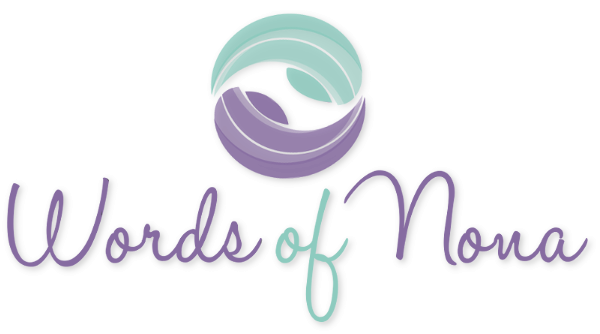
I think the colors of your logo are very different to what we usually see in the translation industry – they’re very peaceful and soothing in a way. Was that on purpose? Why did you choose those specific colors?
I wanted colours that could represent who I am: young, fresh, chilled out…
I didn’t want anything that could look too corporate because I am not! I have always liked the Fortnum and Mason shade, and I thought that violet could complement it very well.
And the Fortnum and Mason represent the UK, which is part of your journey – that makes sense! What about your logo? What does it represent?
The logo is the creation of the guys from Websites for Translators.
I briefed them a bit about my ideas but I wasn’t able to visualise any particular image that I wanted to use…and they came up with this idea. The logo represents two faces looking at each other, but I love the fact that it also looks a bit like a spiral, to represent the never-ending flow of communication.
We all know that branding is more than a name and a logo. If you had to choose three words to represent your brand, which ones would they be?
Approachable, proactive and fresh- I want my clients to feel at ease with me and to know that I am absolutely committed to what I do.
Finally, how do you manage to convey these aspects (the things that you just mentioned in the previous question) to your customers?
I try to understand their needs and expectations, offer something extra (i.e. advice for their social media strategy, tips about something I know that might be useful for them) and simply look after them the best I can!
Related Posts


