Hello there, it’s Sara Colombo here. How are you? ☺
And… what am I doing here? Don’t worry, I am not occupying new spaces and I won’t take over your blogs in the future! This quick irruption has been planned, as Emeline and I have teamed for a series of projects and then decided to exchange our blogging roles, so today I am gonna interview her on…well…branding!
Emeline is a young freelancer juggling family and career with determination and a positive approach. Two aspects that also define her brand, which, in my opinion is also really nice and warm. She started out right after completing her university studies and now is (successfully) growing her small Brussels-based translation business, In Touch Translations.
Hi Emeline, thank you for having me here again, it’s a lovely new website! Let’s talk about you, how did you get into the industry?
Hello, Sara! Thanks for being part of this series once again – it’s very strange to put myself in the shoes of the many people I have interviewed so far, but this is a lot of fun! Well, I’ve been a translator for four years now – while I was still a student, I started translating for one of the research centers of my university and I knew this was something that I wanted to keep doing for the rest of my life!
As for the industry in itself, you have to go back to 1 year ago. I was pregnant and finishing my MA. I had done a few internships before and I knew I didn’t want a regular 9 to 5 job – the mentality, the rules, the atmosphere, etc. just didn’t suit my personality. I was used to organize my work how I wanted to because of university, and I really liked that and wanted to keep that freedom. I seemed to be perfectly cut out for freelancing! During my last semester, I only had 2 classes per week so that left me with a lot of free time (mind you, I had a thesis to write). That’s when In Touch Translations was born – I used that time to define my business, learn how to manage a company and learn more about the industry. In September 2013, the moment I had waited for for so long finally arrived – I set up my business on the first day of the month. And the rest, is history ![]()
Is branding something you have always wanted to integrate in your business? If not, how did you learn about that?
I knew I wanted to have a logo and a business name and to convey something, a feeling to my clients. I didn’t think of it as branding per se, but more as the identity of my business. To me, it was a way to distinguish myself from other freelancers who didn’t have a business profile. I’m not sure as to where I learned about it – it was kind of a natural process, from looking at other businesses (not necessarily from the translation industry).
In Touch Translations: what does it mean and how did you choose this name?
I brainstormed quite a bit before finding that name. I had a concept in mind: I wanted my business to have an image that would be young, dynamic, feminine, modern and with minimalistic design – a name that would represent me and carry a positive and fresh image within the sector. I knew I didn’t want to add yet another Ling-something to the industry – and all those that I tried didn’t make much sense to me anyway.
I finally settled with In Touch Translations for a number of reasons. First, it carries a sense of communication, which describes the services I offer. Not only do I translate texts, but I mostly help my clients communicate with their partners, clients and audience. It also carries the dynamic and modern feel I wanted to have from the beginning. And finally, it’s a promise to my clients – I will not drop off the face of the earth during their project and will keep “in touch” with them ☺
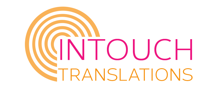
I like how the circular shape of your logo connects the words in the lettering, and the thing I like most is that you created it on your own. Can you tell us something more about your logo and the creative process behind it?
Thank you very much! The original logo didn’t look like that at all… In fact, I didn’t even really have a logo, just the name of my business in a bubbly font… On an orange or hot pink background! While it was fun, it wasn’t very professional looking, if you ask me. I wasn’t satisfied with it – it wouldn’t translate well online because the colors were too loud, so I tried to focus on the minimalistic aspect of it. Opting for a white background changed everything!
As for the circular shape, it is actually a target. I chose this symbol for 3 reasons:
- In communication, you always have a target – the person or the audience you are addressing and this is very important in terms of the words, the register and the style you are going to choose. And that’s exactly how I want to help my clients. Many of my clients are not writers and they don’t even have the time to write their own content. By hiring me, they know that I will focus on these aspects of their profile and documents to ensure efficient communication and higher prospect response.
- It carries a very strong meaning – focus and determination, which are two characteristics that qualify me and my work perfectly. I tend to be very passionate in everything I do and I believe that it reflects in my work.
- And lastly, “target” is part of the translation terminology, isn’t it?

So this tiny symbol encompasses three levels that are central to my business: my clients, my services and myself.
Can you define your brand in three words?
Approachable, dedicated and dynamic.
Finally, is there anything you would like to improve about your branding strategy?
Not about my branding strategy per say, but since I created the logo myself, I didn’t give much thought about reusability. A professional designer would do that sort of thing. This means that if I wanted to have variations or a rebranding, things would slightly be more complicated (but thankfully not impossible to do!). In the future, I plan to hire a professional designer to prevent this kind of issue from happening and to gain professional insight on my brand, which can be nothing but beneficial for me and for my business.
Related Posts

