

 After a short break, the series is back just in time to end the year with a wonderful new interview. Today, I am speaking with Catherine Christaki, one of the two owners of Lingua Greca, a small translation company working with English and Greek. Catherine does not need much further introducing as I am sure most of you already know her very popular blog, Adventures in Technical Translation.
Hi, Catherine ! First of all, thank you for taking the time to take part in this series. I know you are quite busy settling in Canada at the moment, so I really appreciate it. For those who wouldn’t know who you are, can you tell us a little bit about yourself and your business ?
Thank you for having me Emeline ! I really enjoy these branding interviews, so interesting to read what’s behing the lovely translator logos and websites :)
I was born and raised in the lovely island of Crete in Greece. I studied Modern Languages in the UK then returned to Greece in 2001 to be a freelance translator. In 2010 I discovered the wonderful translation community on Twitter and then came our website, blog, and Facebook and Google+ accounts. Lingua Greca Translations as a company was founded in 2012. To explain why I switch between ‘I’ and ‘we’, the second partner of Lingua Greca Translations, is my husband and fellow translator, Christos Floros. We work mainly with other translation companies, might expand a bit into direct clients in Toronto now. We translate from English French, German into Greek and we specialise in IT, Technical and Gaming. The main reasons behind our big move to Canada (apart from the fact that we are winter people) were the business mentality, the multiculturalism and the state of government, health, education etc. of Canada. Actually, it’s easier to say what we miss from Greece : family, friends and yummy vegetables :)
You have recently revamped your website. What motivated such a change ?
We met a lovely web consultant who works on the same building as our previous world headquarters in Athens! He helped with a few small changes and then recommended moving our website to the WordPress platform (our blog was there already) because I kept complaining that our site platform wasn’t as easy to use as WordPress. We ended up spending way more time than initially intended but we are very happy with the final (well, it’s never really final ; you know how it works, there’s always something to improve) result. It makes sense to have both your site and blog on the same platform and it’s much easier for management, updates, analytics and so on, not to mention very important for SEO.
If I had to pick my favorite thing about your brand, it’s the name of your business. It just sounds right ! How did you come to choose it ? Was there a lot of brainstorming involved before you decided this was the one ?
Thank you for your kind words, Emeline ! We love it too and it felt just right when we thought of it. I didn’t think at the time it would sound a bit weird to North Americans and that, for the life of them, they wouldn’t be able to spell it right, but it works overall I guess.
As for the brainstorming session, it took part during the ATA annual conference in Denver in 2010. We needed a name for our Twitter account and the site/blog we were planning to create. We started playing around with the words ‘language’ and translation’ but we had to include ‘Greek’ as well, since we didn’t plan to offer other language pairs. Both I and Christos studied Latin at school and we liked the idea of using Latin for our company name and subsequently the sound of ‘Lingua Greca’.
What about the logo ? I really like how the two arrows are put together to create a butterfly. Is there a reason behind that particular animal ?
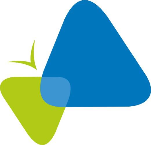 I can’t take any credit for that, that was the brilliant work of Orasi, an Athens-based printing company. Our brief to the designer was short. ‘We are translators. We want a professional but also creative design, nothing too strict. Our favorite colors are blue and green.’ That was it ! The butterfly logo was the first and only one they sent. We just played around with the placement of the words ‘Lingua Greca’, nothing else. That’s the beauty of working with creative people who get you :)
I also like the little world you created which now appears on the header. Was it your idea or your designer’s idea ? How was it brought to life ?

Another creative professional was responsible for that, the web designer who built the first version of our website and also came up with the tagline ‘You create, we translate’ (he though of that during our first meeting, just like that !). Our brief with him consisted of us talking about our work and backgrounds. The only think we had at the time was the logo. We said we wanted something clean, uncluttered, modern and again creative (fun but in a professional, elegant way). He sent a few designs, we picked the image with Catherine and Christos (I seriously think they look like us, he even made them chubby, hehehe) sitting on a meadow with their laptops and that’s it. A few months later our first site was live. Our current web consultant created the header slider (his idea), we just chose how many slides to include and their contents (another work in progress…).
And now for the traditional questions! We all know that branding is more than a name and a logo. If you had to choose three words to represent your brand, which ones would they be? Finally, how do you manage to convey these aspects to your customers?
Well, how about I let our clients answer this question instead? Last March, at the annual GALA conference in Istanbul, I won a brand study from the company Latitudes Training, Coaching and Consulting and our good friend Marcela Reyes. The study consisted of a questionnaire that was sent to 43 of our main clients asking them 8 questions regarding the services we offer them. These are some of the key findings (answers from our clients):
Key brand attributes: responsive, timely, very professional, reliable
Differentiating attributes: dependable, helpful, punctual, friendly
The pièce de résistance: If Lingua Greca were an animal, what animal would it be and why?
31% percent replied ‘Dog’, because “is always there for you no matter what; they are faithful and loyal as a dog; they are reliable and loyal.”
We loved that! Being seen as helpful and reliable, problem-solvers. That has been our branding objective from the start, especially towards fellow linguists but to clients as well. We need to focus our content marketing on clients a bit more, i.e. write and share more content that is relative to our fields of specialisation instead of translation and languages alone. But overall I think we are on the right path ![]()
And I definitely agree! Thank you for this very insightful interview, Catherine!
I really enjoyed this interview! And, believe it or not, I had not noticed the two figures with laptops on the meadow Lingua Greca is a great name for your business, very easy to remember and so representative of what you do.
I too like to read about other brands – how they came up with the name, logo and the rest. So, thank you, Emeline.
Great interview! It’s so good of Catherine to give a shout-out to the creatives who helped mould her brand The brand study results are really interesting, too. Looking forward to the next one!
Glad you liked the interview girls Working with amazing people is the most important thing, for both freelancers (clients & colleagues) and companies (partners, providers, colleagues, and again, clients). Happy New Year!